Alarming Interactive Map Shows How Climate Change Could Make NYC Feel More Like Arkansas Soon Enough
Feb. 13, 2019, 9:59 a.m.
Our northerly city will take on southerly climes.
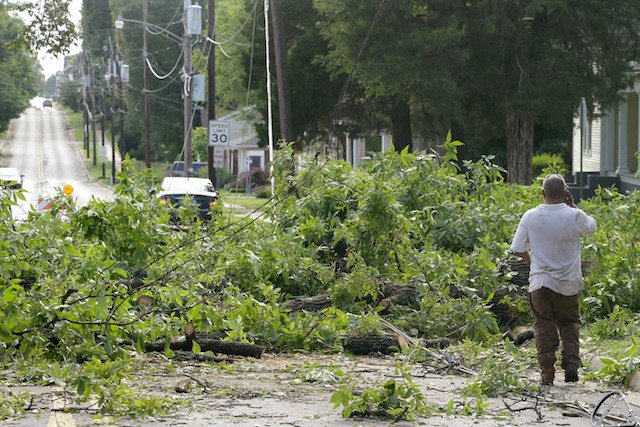
This is Jonesboro, Arkansas, after a 2014 storm. By 2080, New Yorkers will feel like they live there, not here.
We come at you fairly frequently with dire predictions about the mayhem that will unfold if atmospheric warming continues at its current rate—hell, will probably unfold regardless of whether or not we drastically slash our carbon emissions right this very moment, so long have we neglected the problem. Expert after expert has repeatedly clarified that this willful ignorance likely means manifold destruction: Devastating flooding that drives island and coastal populations inland, creating mass overcrowding; horribly hot, suffocating heat; drought and, thanks to untenable growing conditions, famine; fires; the rapid death of coral reefs and many other forms of wildlife; disease.
All of this, climate reports have emphasized, is likely to begin much sooner than previously expected, within the next 10 years in fact. But if you require a more visceral visual in order to really wrap your brain tentacles around the staggering scale of looming change, consider this scary map. Click on your city, and by way of comparison, the map reveals what the climate there will feel like in 2080.
New York City, according to the cartological oracle, will have taken on a climate comparable to Jonesboro, Arkansas, in 2080. For reference, the high there today is 54 degrees, while here in NYC, the high is 33 degrees and we've enjoyed a snow-ice storm.
U.S. Climate Data suggests that this might mean our city becomes more temperate all year round: The annual average temp for Jonesboro clocks in at a mild 59 degrees, while the average low comes in at a paltry 48. The average high hovers at 70 degrees, which actually sounds like it would a vast improvement over the typical NYC summer, in which scalding air combined with leaden humidity make you feel as though you live inside the molten center of a lava cake. But currently, our annual average temp is 55 degrees, with a low of 48 and a high of 62.
And then, keep in mind that the eviscerating heat waves will only become more frequent in coming years.
According to NBC 4 New York, the map's creator—University of Maryland Center for Environmental Studies ecology professor Matt Fitzpatrick—chose 540 different cities where he could examine the effects of 12 different environmental variables—things like minimum and maximum temperature, along with seasonal precipitation levels—under two separate climate change scenarios: One in which we plow ahead on our current path to destruction, and another in which our emissions peak in the middle of the century, but decline thereafter. Factoring this data together with the results of 27 different computerized climate models, Fitzpatrick matched each city with its most similar climatic counterpart.
"The children alive today, like my daughter who is 12, they're going to see a dramatic transformation of climate," Fitzpatrick told NBC 4. "It's already underway."
If you're interested in seeing the world as the children one day will, the map is available here for your viewing horror.